Branding and Logo Design for Minnesota Nonprofit ‘Project 412’
Connect
Meet Izzy
You’ve poured your heart and soul into your business. Now it's time for people to connect with your work, but first, they need to see YOU. Let me help you
be SEEN.
Check out my best website design resource: the Ultimate Website Prep Checklist and Resource Guide. You can grab yours for free now!
Back to all Blog posts
November 22, 2022
I am so excited to share with you all the branding and logo design I created for my latest Bold Brand Buildout client, Project 412.
Project 412 is a new nonprofit organization in the Detroit Lakes area of Minnesota, US.

Learning about Project 412
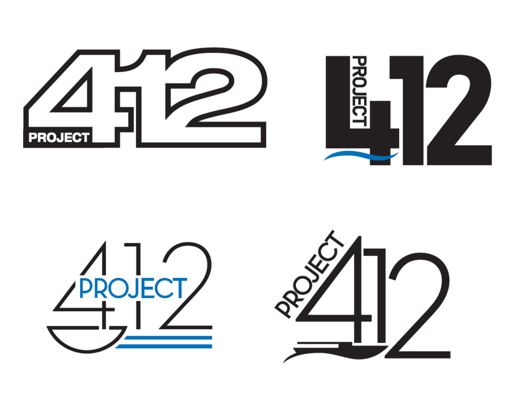
When this team first came to me they had A LOT of ideas and directions for where they wanted to take their branding. They had mocked up a few basic logo ideas before coming to me. You can see in the photo above what the team was originally thinking for a logo design.
I spent a few hours with the team on a zoom call where I got to ask them questions about their values, the mission of Project 412, and how they wanted others in the community to see them.
A few things they repeated to me often were wanting to:
⭐ Look professional and modern
⭐ Feel polished and approachable
⭐ Reflect the lakes area and community
⭐ Create an elevated vibe

The branding process
Then it was my job to look inside the mind of this team and establish a logo, pick colors, find fonts, and create the master planning behind how their brand should look, act, and feel.
I sent the team a few iterations of mood boards, color options, and font choices until we found a set that perfectly captured the spirit of Project 412

Logo Design
Then the fun of logo design started! This was an interesting process as I had an entire team of individuals that all had to love the end logo. As you can imagine there were often split opinions I worked around.

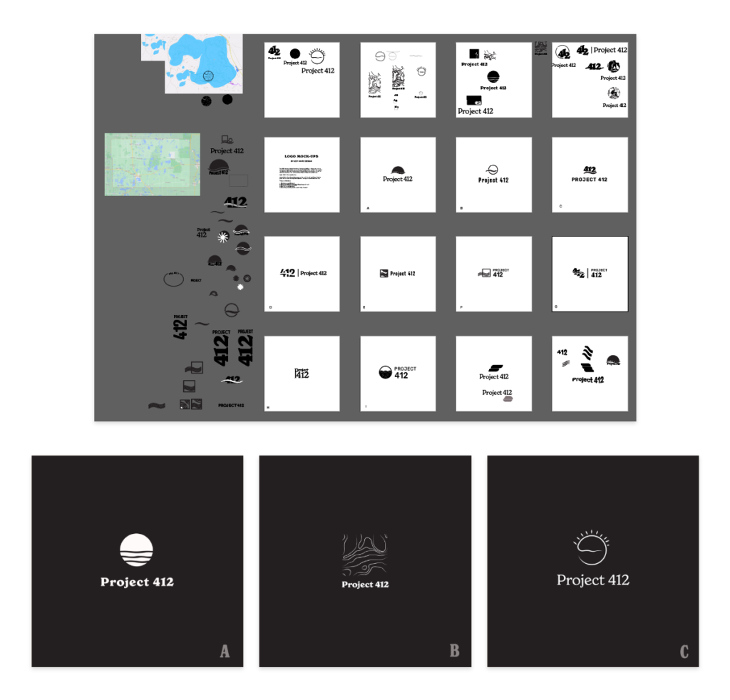
The larger photo above is a screen grab from behind the scenes while I was working in Adobe Illustrator to create a logo design. I made many logo variations and in the end, I chose my three favorites to present to the team. We went back and forth a few different times until we landed on a logo we all thought conveyed the values of Project 412.

Final Logo
In the end, we decided to create a logo with a modern but youthful serif font and pair it with this box/wave icon. The idea behind the icon was to incorporate the waves of the Minnesota lake area and mix in the idea of “thinking outside of the box.”
I am very excited to see Project 412 take off as they continue to make big waves in their community.
Let’s hear it in the comments for Project 412!


Bold Brand Buildout
Are you ready to:
- Build trust and credibility through a clear & consistent brand identity
- Express your energy & passion as a brand that feels authentically you
- Feel more established & elevate your business above the noise
- Become known & recognized for your work
Then contact me today about your own Bold Brand Buildout
DELIVERABLES:
- Brand Strategy Meeting – where we’ll dive deep into your vision & values
- Design Concept Meeting – where we’ll pick out themes and ideas
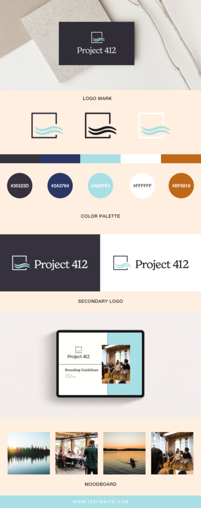
- A branding guide booklet to help you implement your new brand across all channels, including: mood board, colors, fonts, logo guidelines, photo usage, design elements, and more!
- Original Logo Design including 3 original design mockups, 2 logo revisions, 2 final logo (dark and light), and a Favicon
You’ve poured your heart and soul into your business. Now it’s time for people to connect with your work, but first, they need to see YOU. Let me help you be SEEN.
Back to all Blog posts
Three Promises of Izzy Waite Design
Authentically You Branding
Collaborative & Fun Process
Don’t have it all figured out? That’s ok! My process will meet you where you’re at and help translate your ideas & vision into a brand you’ll love.
Results-Driven Design
By blending aesthetics with strategic design, we’ll make sure that your website not only looks amazing, but has a user-friendly layout that increases inquiries.