
Why Your Color Palette Matters in Digital Identity
Connect


Meet Izzy
You’ve poured your heart and soul into your business. Now it's time for people to connect with your work, but first, they need to see YOU. Let me help you
be SEEN.
Check out my best website design resource: the Ultimate Website Prep Checklist and Resource Guide. You can grab yours for free now!
Back to all Blog posts
March 31, 2024
Maximizing Impact With A Color Palette
A common mistake is believing that a color palette is less important than a social media strategy… The truth is with a well-chosen palette, you can capture more attention and create a memorable experience for your users, making them want to learn more about you.
Here are three truths you might not know about the importance of color choice on your website, which can make a difference in your digital identity:
1. Influence Purchase Decisions:
Research indicates that a staggering 90% of purchasing decisions are swayed by color psychology. This makes it imperative to choose hues that resonate with your target audience’s emotions and perceptions. For instance, the strategic use of warm and inviting colors can foster a sense of trust and familiarity, encouraging users to explore further.
Example 1:
For instance, the first palette (left, Project 412) uses more subtle and sophisticated colors, like shades of blue and white, suggesting a sense of refinement and style. The other palette (right, Bleed Heart Floral) evokes a feeling of warmth, closeness, and friendliness, as it aims to convey a welcoming, approachable, and friendly image.

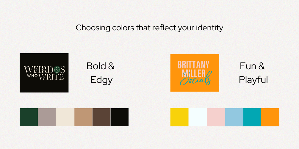
2. Boost Brand Recognition through Your Color Palette:
Consistency is key when it comes to your color palette, as it bolsters brand recall and cultivates a cohesive identity across all platforms. By maintaining a uniform color scheme in your web design and marketing collateral, not only do you reinforce brand recognition, but you also establish a lasting connection with your audience. Consequently, this connection leads to heightened brand loyalty over time.
Here’s another example of how the color palette has the magic to express the brand’s unique essence (left, Weirdos Who Write) and what it seeks to convey, generating an instant connection and coherence (right, Brittany Miller).
Example 2:
3. Impact User Engagement:
The right color combination can significantly impact user behavior. As a result, it influences the time spent on your website and the depth of interaction with your content. Studies have shown that visually appealing and harmonious color schemes can entice users to delve deeper into your site. This fosters prolonged engagement and reduces bounce rates.
Now the question is… where do you start? I know this can be overwhelming, and that’s why I’ve crafted a comprehensive guide to assist you in selecting an optimal color palette that reflects your brand’s essence while empowering you with the knowledge to build an unforgettable digital presence.
Are you ready to make your website shine?
You can download the “Free Branding Starter Guide” here now to kickstart your journey toward a visually captivating website that resonates with your personality and brand values!
Back to all Blog posts

Three Promises of Izzy Waite Design
Authentically You Branding
Collaborative & Fun Process
Don’t have it all figured out? That’s ok! My process will meet you where you’re at and help translate your ideas & vision into a brand you’ll love.
Results-Driven Design
By blending aesthetics with strategic design, we’ll make sure that your website not only looks amazing, but has a user-friendly layout that increases inquiries.

