
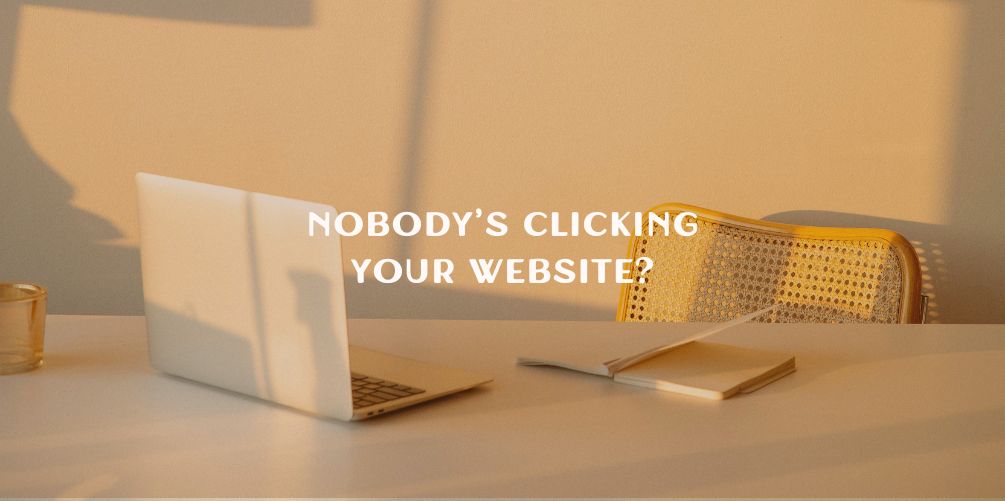
Nobody’s Clicking Your Website?
Connect


Meet Izzy
You’ve poured your heart and soul into your business. Now it's time for people to connect with your work, but first, they need to see YOU. Let me help you
be SEEN.
Check out my best website design resource: the Ultimate Website Prep Checklist and Resource Guide. You can grab yours for free now!
Back to all Blog posts
August 4, 2025
Here’s Why (and what to do about it)
Have you ever stood in front of a restaurant menu with 40 different dishes…
And ended up ordering the same thing you always get?
That, my friend, is analysis paralysis and it’s very real on websites too.
If you’ve been wondering why people land on your homepage but don’t click, book, or buy, it might not be your services. It could be that you’re offering too many choices all at once.
Let’s talk about what’s really going on and how to fix it.
Why people aren’t clicking
When your homepage has:
- 6 different buttons
- 3 service options
- A freebie opt-in
- A newsletter signup
And a tiny “Book a Call” link hidden halfway down the page…People get overwhelmed.
And when people feel overwhelmed, they don’t take action, they leave.
This is true on Instagram too. If every story slide is packed with polls, links, questions, and call-to-actions, your audience gets confused and checks out. Even if they love what you do.
More options = more stress.
More stress = less action.
But don’t worry, this doesn’t mean you need to remove everything. It just means you need to guide your visitors with more clarity and intention.
3 Website fixes to get more clicks
If you want more people to click, book, and buy, start here:
1. Use ONE clear CTA per page
Every page should have one clear next step. Whether it’s “Book a Call,” “Join the Waitlist,” or “Download the Freebie,” make it obvious what you want people to do.
2. Guide visitors like a friendly host
Think of your website like a cozy boutique. Don’t leave your visitors wandering, guide them step-by-step. Use headlines, short sections, and CTA buttons to walk them through your content like a friendly shop assistant.
Your website isn’t just a place to look pretty, it’s a tool to lead people to take action.
3. Make decisions feel easy
Instead of giving people five options, try narrowing it down to one clear, aligned offer.
This makes their decision feel easy, aligned, and obvious.
And when something feels easy to do… people do it.
Ready for a Website That Converts?
The truth is: your dream clients want to work with you.
You just need a brand and site that make it easy for them to say YES.
That’s exactly what I do inside my Branding & Website in a Week offer, a streamlined, strategic process that blends design + clarity to help you stand out and convert.
🎯 Want to make sure your clients aren’t stuck in scroll limbo?
Book your free discovery call here and let’s talk about how to turn your website into your best sales tool.
For full branding and website design, check out our Website in a Week package.
For quick turnaround changes to your website, check out the One Day Website Refresh.
Back to all Blog posts

Three Promises of Izzy Waite Design
Authentically You Branding
Collaborative & Fun Process
Don’t have it all figured out? That’s ok! My process will meet you where you’re at and help translate your ideas & vision into a brand you’ll love.
Results-Driven Design
By blending aesthetics with strategic design, we’ll make sure that your website not only looks amazing, but has a user-friendly layout that increases inquiries.

