

How to Choose Brand Colors for Your Small Business (And Actually Mean It)
Connect


Meet Izzy
You’ve poured your heart and soul into your business. Now it's time for people to connect with your work, but first, they need to see YOU. Let me help you
be SEEN.
Check out my best website design resource: the Ultimate Website Prep Checklist and Resource Guide. You can grab yours for free now!
Back to all Blog posts
August 17, 2026
Most people choose their brand colors one of two ways:
- They screenshot a palette from Pinterest that “feels right”
- They just go with their favorite color and hope for the best
And then six months later, they’re staring at their website thinking… why doesn’t this feel like me?
Here’s the thing. Color is one of the most powerful tools in your entire brand. It communicates emotion before anyone reads a single word. It shapes how people feel when they land on your page, scroll your feed, or open your email.
That means choosing your brand colors shouldn’t be random.
It should be intentional.
Let’s talk about how to actually do that.
Why Brand Colors Matter More Than You Think
Color influences purchasing decisions. It shapes first impressions. It tells your audience before you’ve said a word whether you’re playful or serious, earthy or elevated, soft or bold.
Studies show that people form an opinion about a product within 90 seconds, and up to 90% of that judgment is based on color alone.
So if your brand colors are sending the wrong message?
People are bouncing before they ever read your bio.
The goal isn’t to pick colors you love (although that matters too). The goal is to pick colors that attract the right people while still feeling completely like you.
Step 1: Get Clear on the Feeling First
Before you touch a color wheel, get clear on the emotion you want your brand to create.
Ask yourself:
- How do I want people to feel when they land on my website?
- What words would my dream client use to describe my brand?
- If my business were a person walking into a room, how would they show up?
Write down 3–5 words. These become your emotional anchor.
Some examples:
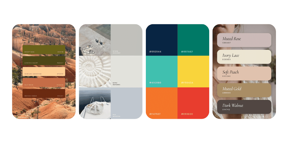
- Warm, earthy, grounded, trustworthy, approachable → think terracotta, sage, warm beiges
- Fresh, clean, minimal, modern, calm → think soft whites, muted blues, cool grays
- Bold, energetic, creative, playful, confident → think saturated hues, contrasting pops of color
- Romantic, soft, feminine, luxurious, delicate → think blush, dusty mauve, antique white, champagne
Your colors should make someone feel those words before they even process them logically.
Step 2: Understand Basic Color Psychology
You don’t need a design degree for this. Just a basic understanding of what colors communicate and then permission to trust your gut.
Here’s a quick reference:
Warm tones (reds, oranges, yellows) Energizing, attention-grabbing, passionate. Great for brands that want to feel lively and inviting.
Cool tones (blues, greens, purples) Calming, trustworthy, sophisticated. Great for service-based businesses that want to feel reliable and grounded.
Neutrals (creams, taupes, grays, blacks, whites) Timeless, elegant, versatile. These are your anchor colors — the ones that hold the rest of the palette together.
Earthy tones (terracotta, olive, rust, sienna) Organic, warm, connected to nature. Incredibly popular right now for farms, wellness brands, and businesses with a handcrafted or artisan feel.
Note: Color psychology isn’t a rigid rulebook. Context, combinations, and your overall brand identity matter just as much as individual hues.

Step 3: Build a Palette — Not Just a Color
One color is not a brand palette.
A full brand color palette typically includes:
- 1 primary color — your signature, the one you’re known for
- 1–2 secondary colors — complement and support the primary
- 1–2 neutral colors — backgrounds, text, breathing room
- 1 accent color — used sparingly for buttons, highlights, bold moments
The magic is in how they work together. A palette that’s too similar feels flat. Too contrasting feels chaotic. You’re looking for harmony with a little tension like a good conversation.
A quick sanity check: Can you look at your palette and immediately feel the emotion you wrote down in Step 1? If yes, you’re on the right track. If something feels off, keep refining.

Step 4: Test Your Colors in the Real World
This part gets skipped more than any other.
Picking a palette on screen is one thing. Seeing how it actually looks in use is another.
Before you commit, test your colors:
- On a mock social media graphic — do they still feel right when you add text?
- On a white background and a dark background — does the contrast work?
- In natural lighting and screen lighting — colors shift more than you’d expect
- Against photos you already have — do your brand photos complement the palette, or clash?
If you’re using Canva, this is where a Brand Kit is your best friend. I walked through exactly how to set that up in this post → How to Set Up Your Brand Kit in Canva (and Actually Use It Consistently)
Step 5: Keep It Consistent
Picking the colors is only half the job.
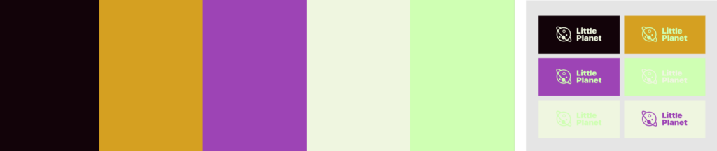
Using them consistently is what actually builds brand recognition.
Every social post. Every email. Every slide deck. Every invoice. Every packaging sticker.
Same colors. Every time.
Because consistency is what makes your brand memorable and memorable is what makes people come back, refer others, and trust you before they’ve even met you.
If you haven’t already, download my Free Branding Starter Guide here.
The Shortcut That’s Not Actually a Shortcut
Here’s what I hear a lot:
“I’ll just copy what I like from other brands.”
I get it. It feels easier. But here’s the problem: their brand colors were chosen for their personality, their audience, their vibe. Not yours.
When you borrow someone else’s palette, you’re wearing their clothes. Things might technically fit but they won’t feel like you.
And your clients can feel that.
The brands that people actually remember? They have a look that’s undeniably, unmistakably theirs.
That’s not an accident. That’s strategy.
You Don’t Have to Figure This Out Alone
If you’ve been staring at color palettes for weeks and still can’t land on something that feels right…
That’s not a you problem.
It’s a signal that you might need someone to help you articulate what your brand is actually trying to say before you choose how it looks.
That’s exactly what the strategy side of my design process does. We get clear on the feeling first, then build visuals that bring it to life.
For full branding and website design, check out our Website in a Week package
For quick turnaround changes to your website, check out the One Day Website Refresh.
Because your brand colors should feel like a deep exhale — yes, that’s it. Not a compromise. Not “good enough.”
Exactly right.
Have more questions?
How many colors should a brand have? Most brand palettes include 4–6 colors: one primary, one or two secondaries, one or two neutrals, and one accent. More than that and things start to feel chaotic.
Can I change my brand colors later? Yes but it takes intention. A color rebrand affects every touchpoint: your website, social media, packaging, and more. It’s doable, but plan for a real transition period.
Should my brand colors be my favorite colors? They can be, but that shouldn’t be the only reason. Your colors should reflect your brand’s personality and appeal to your target audience, not just you. That said, if you hate them, you won’t use them consistently. So the sweet spot is colors you love and that make strategic sense.
What if my industry has typical colors everyone uses? That’s actually an opportunity. Standing out in a saturated market is easier when your visual identity doesn’t look like everyone else’s. You don’t have to follow the industry template, you just have to make sure your colors still communicate trust and credibility for your specific audience.
Back to all Blog posts

Three Promises of Izzy Waite Design
Authentically You Branding
Collaborative & Fun Process
Don’t have it all figured out? That’s ok! My process will meet you where you’re at and help translate your ideas & vision into a brand you’ll love.
Results-Driven Design
By blending aesthetics with strategic design, we’ll make sure that your website not only looks amazing, but has a user-friendly layout that increases inquiries.