Branding Red Flags: Stop Losing Clients
Connect
Meet Izzy
You’ve poured your heart and soul into your business. Now it's time for people to connect with your work, but first, they need to see YOU. Let me help you
be SEEN.
Check out my best website design resource: the Ultimate Website Prep Checklist and Resource Guide. You can grab yours for free now!
Back to all Blog posts
Avoid These Mistakes Today
If you keep hearing crickets from your ideal clients, then it’s time to pay attention to these red flags in your branding.
Red Flag #1: “A logo doesn’t mean branding”
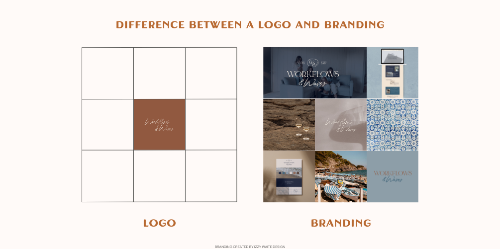
You have a logo, but that’s just one part of your branding. Branding includes many more elements like a color palette, brand elements, logo variations, backgrounds, and more.
If you’ve been relying solely on a logo as your branding strategy, it’s time to give your brand the boost it needs and do it with purpose.

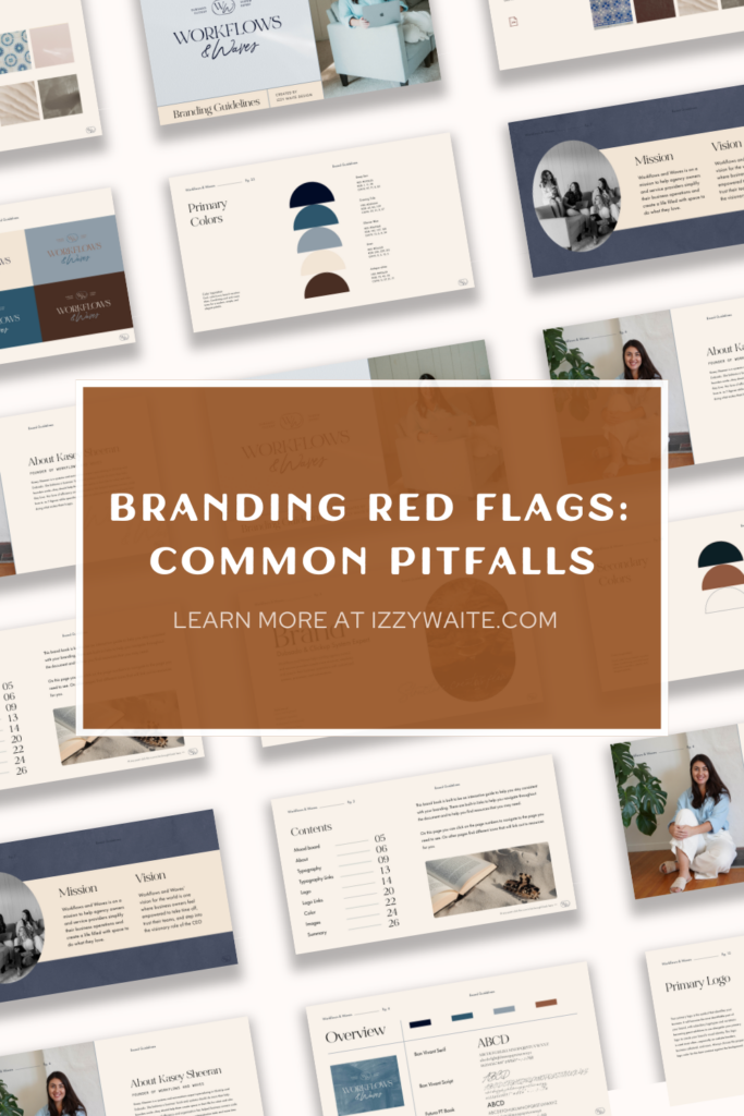
Bonus tip: Develop a brand style guide that includes specific colors, fonts, images, and the tone of voice you will use across all your communication channels.
Red Flag #2: “Tell me how you use your fonts, and I’ll tell you if I’m interested in reading your content”
A very common mistake is not paying attention to the fonts you use and the proper hierarchy. The type of fonts you use can completely change the vibe of your branding. A well-chosen font can convey a lot and complement your captions.

Example: Suppose you use a very ornate font for all your content, including product descriptions and blogs. While it might look pretty, if it’s hard to read, customers will get frustrated and stop reading your content.
But that’s not all. They must be used according to the hierarchy, which makes reading easier and highlights what you want to show first.
Bonus tip: If finding the perfect font pairing is hard for you, you can even type in search terms like “font duo pack” on Creative Market.

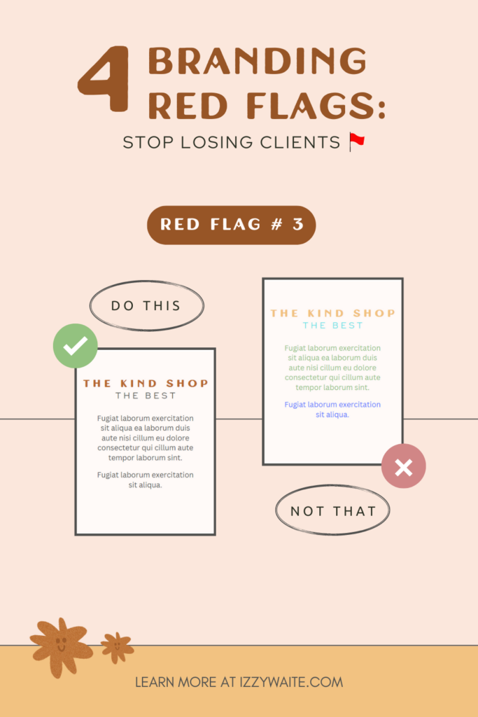
Red Flag #3: “Inconsistent Color Palette”
A color palette can make you stand out.
If you:
- Pick colors that clash
- Pick colors just because the rest of your industry is using them
- Have only one or two main colors
- Use overdone color combos
Let’s change this!
Colors can say so much about your business. This isn’t a new trend; in fact, color psychology has been used in marketing for years. A consistent and coherent color palette can elevate your brand’s presence among the crowd.
Bonus tip: Make a mood board to find colors that speak to you. Think of it as a visual collage that helps you define the vibe and style you want.
Red Flag #4: “No branding strategy”
Following trends can be very tempting and sometimes it can make you lose the essence of your brand. That’s why your branding needs a clear strategy to help you make the most of your branding and maintain consistency to convey a clear message to your future clients.
A few points to consider:
- Brand analysis
- Definition of the target audience
- Key message and tone of voice
- Value proposition
- Visual brand elements
Free resources you might dig 🔽
Branding Starter Guide, if you need some help to build your dream branding.

Back to all Blog posts
Three Promises of Izzy Waite Design
Authentically You Branding
Collaborative & Fun Process
Don’t have it all figured out? That’s ok! My process will meet you where you’re at and help translate your ideas & vision into a brand you’ll love.
Results-Driven Design
By blending aesthetics with strategic design, we’ll make sure that your website not only looks amazing, but has a user-friendly layout that increases inquiries.