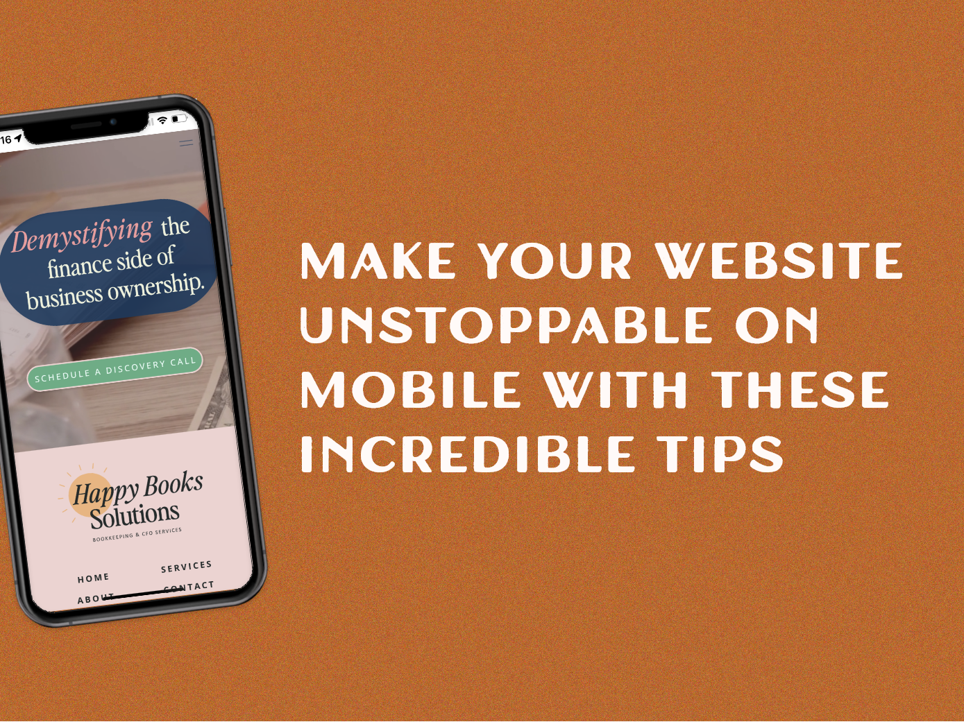
3 Incredible Tips to Make your Website Unstoppable on Mobile
Connect
Meet Izzy
You’ve poured your heart and soul into your business. Now it's time for people to connect with your work, but first, they need to see YOU. Let me help you
be SEEN.
Check out my best website design resource: the Ultimate Website Prep Checklist and Resource Guide. You can grab yours for free now!
Back to all Blog posts
February 9, 2023
The rise of mobile website viewing
With over 4.3 billion users accessing the internet from their phones, it’s essential to create a website that looks great, loads quickly and works seamlessly on any device. It’s no secret that many businesses struggle to optimize their websites for mobile, resulting in lost customers and opportunities.
But, good news: it doesn’t have to be that way.
If you are anything like me when I first started my business I spent hours, and I mean hours, on my desktop website view.
That’s how all the current website-building platforms are set up, right?
You log into Wix or ShowIt and they have the desktop view as the first thing you see. So it’s easy to think that that is where you should be spending all your time.
But that’s not really the case, in fact 63-68% of all website users are on mobile devices and if that’s not enough for you 57% of internet users say they won’t recommend a business with a poorly designed website on a mobile device.
Long story short your mobile website design is important, and should not be overlooked. Here are a few tips to make sure you’re not forgetting this important aspect of your website.
3 tips to create a flawless mobile experience
⭐Create a seamless experience.
You want users to be able to go from desktop to mobile without feeling like they are on a new website. Design both to look and feel like the same website.
⭐Stack your design.
When I say create a seamless experience that doesn’t mean copying and pasting everything exactly as it is on your desktop view over to mobile. You want to create the same look and feel while also remembering that the mobile screen is more narrow than the desktop. I recommend stacking sections and not placing text/photos next to each other horizontally.
⭐Remember fingers are bigger than a mouse pointer
Sometimes when you are creating a design on your website it’s okay to have small text for buttons or other small clickable items. On a mobile design, make sure to space out the items that are clickable. This will make it easier for users to click on items with their fingers.
Back to all Blog posts
Three Promises of Izzy Waite Design
Authentically You Branding
Collaborative & Fun Process
Don’t have it all figured out? That’s ok! My process will meet you where you’re at and help translate your ideas & vision into a brand you’ll love.
Results-Driven Design
By blending aesthetics with strategic design, we’ll make sure that your website not only looks amazing, but has a user-friendly layout that increases inquiries.